 Your website is the first impression your business projects to potential customers. Improving website user experience good user experience is crucial to keep visitors engaged and convert them into customers.
A well-designed website appears high on search engines, converts leads to sales, and avoids lengthy load times. Follow these tips to create the best website experience for your customers.
Create a Captivating Landing Page
Your landing page is the first experience customers have when clicking on your website. Therefore, it’s the most important page. It needs to be clear and captivating; otherwise, they’ll look elsewhere.
Your landing page should communicate everything your customers need to know about your brand. It should also make it easy for them to contact you. Include your social media links and essential portfolio previews.
A good landing page provides easy navigation and no distractions. Chat boxes, pop-ups, and excessive advertising can all prevent a customer from clicking further through your website.
Produce Original Content
Improving website user experience requires original content. If your customers cannot find the content on your website, they’ll click away to a competitor.
Original content can cover common material but requires a unique voice, new information, and a different perspective. Using original art or unique video content enhances the unique experience and guarantees no other website has your content.
Ensure Consistency
Users should have a consistent experience no matter which page they visit on your website. Your brand identity needs to carry through consistently. Use the same fonts and colors across the entire site.
Developing a style guide is one of the best ways to ensure consistency. With a style guide, anyone can update your website without sacrificing continuity.
Increase Conversion Clicks
How can you increase conversion rates? Customers don’t want to work hard to purchase goods or book services. Streamlining the process ensures customers won’t get lost or confused.
- Clear Calls to Action: Make calls to action clear. Saying “Click here to buy our product” creates no doubt about where they’re going. Making clear buttons with attractive colors can increase clicks by 11%. Calls to action should include action words.
- Streamlined Process: Requiring too many log-in or authentification steps can cause customers to give up before they reach your call to action. Enable multiple currency options. Reduce the clicks required for checkout to as few as possible.
Make It Beautiful
If your site is designed with something other than beauty in mind, it may look low-quality or untrustworthy. Use these principles to create a beautiful website.
- White Space: Creating space between titles, pictures, and menus helps avoid crowded websites. White space after a title increases user attention by 20%.
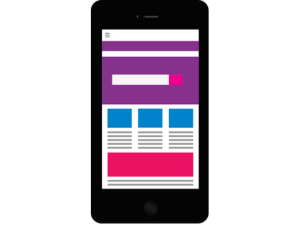
- Mobile Optimization: Most users nowadays visit websites and make purchases through their smartphones. If your users can’t navigate on mobile, you’ll lose a large stream of traffic. Make sure your site looks good on mobile devices.
- Legibility: Make sure you use legible fonts and edit your content. Format your headings and paragraphs to avoid confusing navigation and unattractive content.
Design Your Website to Improve User Experience
Improving website user experience is easier than it sounds. When you use the tips in this guide, your beautiful website is ready to convert leads into paying customers.


